Accordion Block
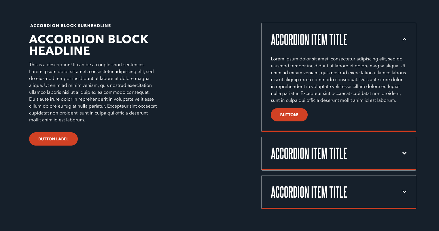
The Accordion Block has a left side containing its main text elements, and then several accordion items— each with a title, description, and button within the collapsed container. The entire block itself has lead in space for headline and description.
Usage
Accordion Blocks are great Accordions are great for situations where you need to tuck long-form content about a related subject behind a collapsed section. One common example would be a list of frequently asked questions (FAQs).
When drafting content in accordion items, be sure the Title property is a good summary of the item’s content. The Title is the only property that displays whether the item is collapsed or not—which also means it’s the only way a reader would know to open the item.
This block is great for listing a lot of related content, but allowing the user to chose what they read and when. This can prevent the reader from being overwhelmed with a wall of text. However, be wary of putting too many accordion items within this block. Requiring your readers to click each item to learn more means that they may navigate away before reading all items.
Properties
The block itself has the following properties:
- Headline: A small piece of descriptive text, stylized in all caps, that appears at the very top of the text area.
- Subheadline: A small piece of header text, stylized in all caps, that appears at the very top of the text area. Typically used to provide a primary description of the block's intent.
- Description: A longer piece of descriptive text, usually providing more details about the headline.
Accordion items
Each accordion item has the following properties:
- Title: The “above the fold” text that always displays within the Accordion Block. Users click this text to unfold the item.
- Description: A longer piece of descriptive text, usually providing more details about either the subject of the header or the destination of the button.
- Button: An optional button that can navigate users to either an entry or URL. For more information on configuring buttons, see the Buttons section of Blocks overview.
Examples