Big CTA and CTA
These blocks provide a specific area for a call to action in your page. These big media moments provide a space for big, attention-grabbing headline, descriptive text, as well as media asset and buttons. These blocks are intended to grab the reader’s attention and persuade them to take action, typically by clicking one of the block’s buttons.
What are the differences between a Big CTA and just a CTA?
- Big CTA blocks animate their text as the reader scrolls into the page element the first time. CTA blocks are static.
- Big CTA blocks will always take up the full width of the page. They also have subtle slanted edges which are filled with a color determined in the Background > Color property.
CTA blocks, while still taking up the majority of the horizontal screen space, will always have some padding on the left and right sides. They do not have slanted edges.
Usage
While the other blocks provide the reason a user should take an action, CTA blocks work as a promotional stop sign.
They’re an eye-catching way to grab your reader’s attention. While they can exist without media, you’ll almost always want a well coordinated asset to offset the block’s text, and the fewer the words in this block, the better.
Big CTA blocks can often go without their Label or Text properties—in some ways it can be more impactful to simply have one large piece of text with several calls to action via the block’s buttons. And due to their large horizontal sizes, a big CTA block can provide a nice closure to a long piece of content.
And though it’s optional, these blocks should almost always have a button. And while you can have more than one button, try not to use too many. You want your readers to be clear on what you want them to do when they encounter this block.
Properties
Big CTA blocks and CTA blocks have the following properties:
- Label/Sub-headline: A small piece of descriptive text, stylized in all caps, that appears just above the headline.
- Headline: The all-caps, large-sized impact statement of the block. The text here will be around 2.5 times the size of normal text.
- The first time a user scrolls to the text in a Big CTA, it will reveal itself by scrolling into view within the block.
-
Text: The detailed, supplementary text of the block.
In a Big CTA this text displays on the right side of the block, beneath any added buttons.
In a CTA this text displays beneath the headline.
-
Buttons: One or more buttons that can navigate users to either an entry or URL. For more information on configuring buttons, see the Buttons section of Blocks overview.
-
Background: The asset appearing behind the text of the block. Can be either an image or video. For more information on the available asset properties, see the Image or background video subsection within the Media assets section of the Blocks overview.
- Color: Big CTA only. Determines the color of the empty space created by the Big CTA block’s slants, or the entire background color if no media is selected.
Examples
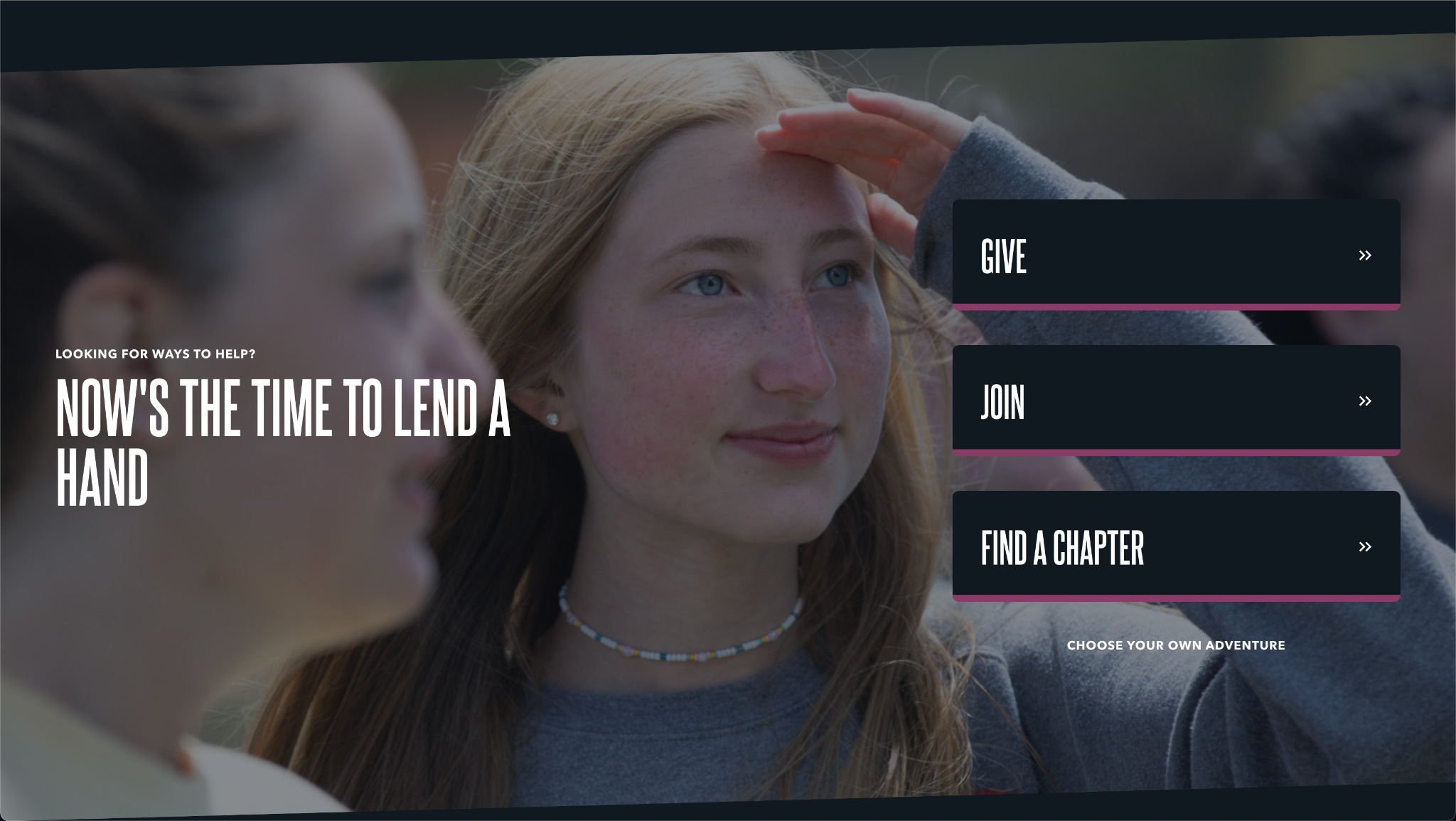
Big CTA with all properties entered
- Label: Looking for ways to help?
- Headline: Now's the time to lend a hand
- Text: Choose your own adventure
- Buttons: Three buttons with the following labels: Give, Join, Find a Chapter
- Background: An image asset of a woman looking to the right
-
- Color: Black
CTA with all properties entered
- Label: Looking for ways to help?
- Headline: Now's the time to lend a hand
- Text: Choose your own adventure
- Buttons: Three buttons with the following labels: Give, Join, Find a Chapter
- Background: An image asset of a woman looking to the right

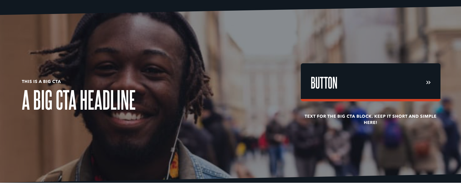
Big CTA - Single button
- Label/Sub-headline: This is a Big CTA
- Headline: A Big CTA Headline
- Text: Text for the Big CTA block. Keep it short and simple here!
- Buttons: A single button with the label Button
- Background: An image asset of a man smiling at the camera
-
- Color: Black
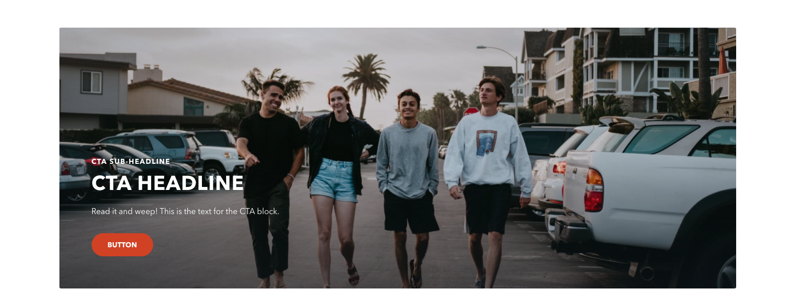
CTA - Single button
- Sub-headline: CTA sub-headline
- Headline: CTA Headline
- Text: Read it and weep! This is the text for the CTA block.
- Buttons: A single button with the label Button
- Background: An image asset of four people walking toward the camera
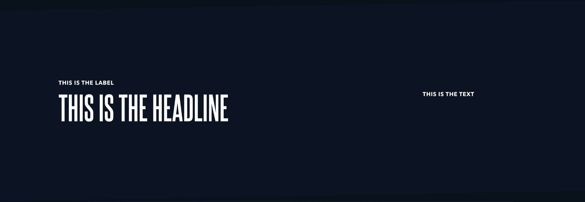
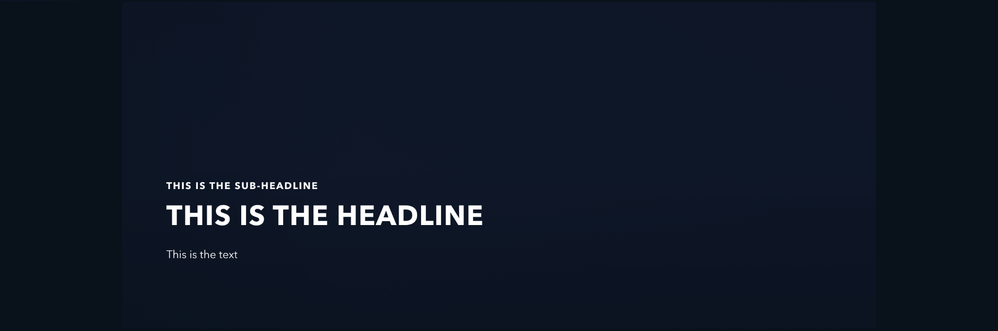
Big CTA - No media or buttons
- Label: This is the label
- Headline: This is the headline
- Text: This is the text
- Buttons: None
- Background: No media selected.
-
- Color: Black
CTA - No media or buttons
- Sub-headline: This is the sub-headline
- Headline: This is the headline
- Text: This is the text
- Buttons: None
- Background: No media selected.