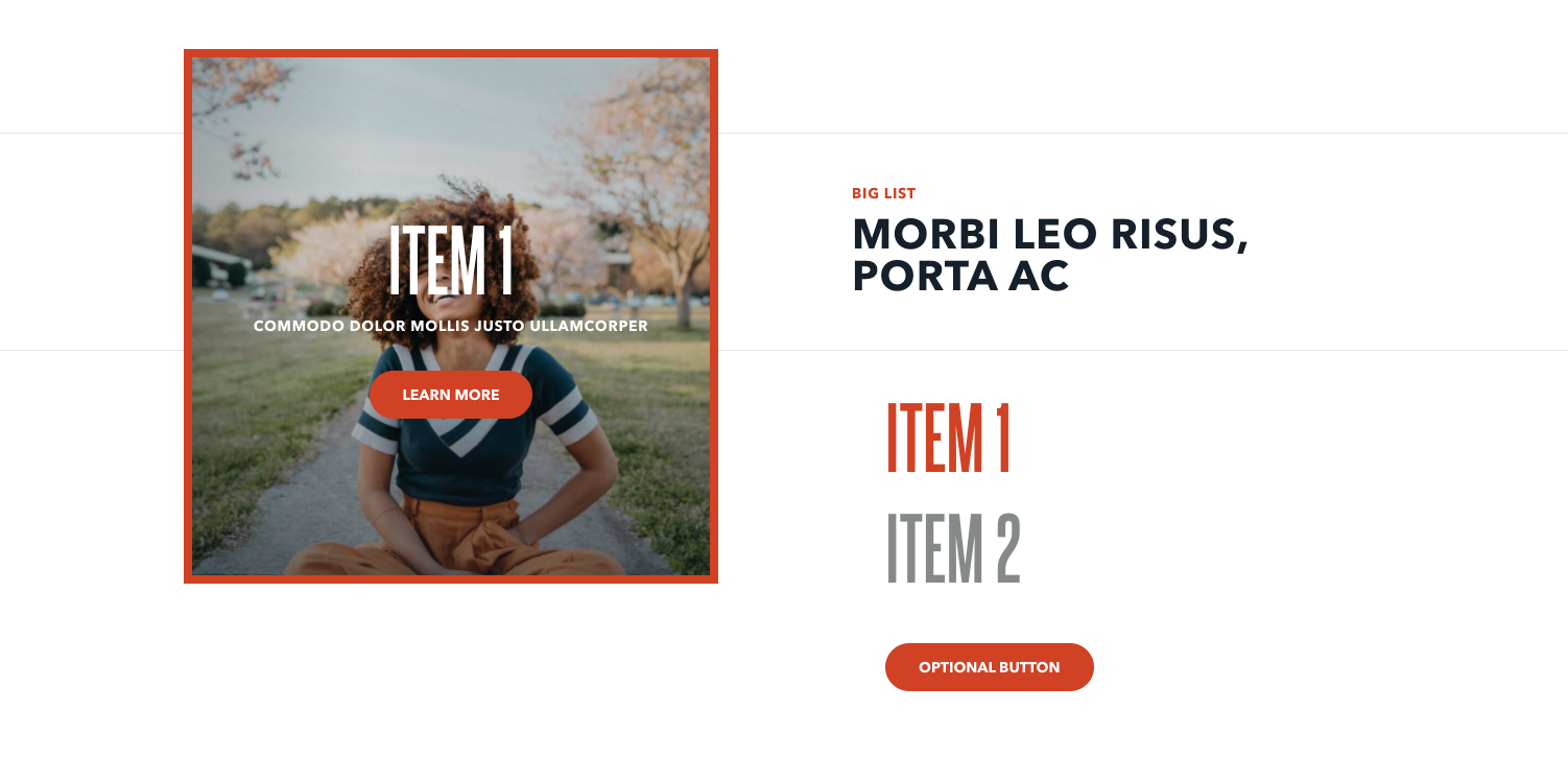
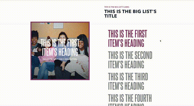
Big List
The Big List block displays one or more list items as a series of interactive square elements. When scrolling through the page, only the first item is displayed until the reader clicks the heading of another list item—which causes that list item’s details to be revealed. There is an optional button for the block itself that, if configured, appears at the very bottom of the list outside of any single list item.
When revealed each list contains the heading, a description, and an optional image. If a label is provided, a button appears within the list item, however the entire element is interactive. The select list item will scroll down the page until the reader reaches the end of the list, which allows readers to see the list item even in longer lists.
There is also the Big List (Chapters) block, which functions the same as the Big List but instead sources its list items from the chapters within the website.
Usage
This Big List is a very interactive block—users will need to manually click the label of a list item in order to see information. So when drafting list items, be sure the heading is informative. Otherwise users may never click the list item to learn more information.
This block can be an excellent way to group related information, because visualizing this information in the square format emphasizes that the list items are related. Because of that, consider using this block for data like events or contacts.
Properties
- Label: A small piece of descriptive text, stylized in all caps, that appears within the list items
- Title: The all-caps, large-sized impact statement of the block. The text here will be around 2.5 times the size of normal text.
- Button: An optional button that can navigate readers to either an entry or URL. For more information on configuring buttons, see the Buttons section of Blocks overview.
Each list item has the following properties:
- Image: The image displayed within the list item. For more information on image properties, see the Media assets section of the Blocks overview.
- Heading: The all-caps, large-sized impact statement of the block. This is the only list item text that displays within the Big List. Once the reader clicks the heading, the rest of the list item’s information displays.
- Description: The longer, all-caps descriptive text that appears within the list item’s square. Used to provide more information about where the list item will send readers if they click the item.
- Action: Determines whether or not the list item navigates to an entry (like a post within the site) or a URL (any arbitrary URL, inside or outside the site).
- Label: A small piece of descriptive text, stylized in all caps, that appears just above the headline.
- Entry/URL: The location the reader is sent to when they click the list item.
- New Window: Determines whether or not the target location of the list item opens in the same window or a new window when the reader clicks the item.
- Style: Determines the visual style of the list item, options include Primary, Secondary, Link, and Simple.
Examples
Longer list with no optional buttons in the Raspberry Lemonade theme
Short list in the Inverted theme