Feature Cards Thirds
The Feature Cards Thirds block contains one or more cards that always try to take up one third of the page’s horizontal space if the reader’s screen size allows. Each card has the same fields for information: an image, heading, subheading, link, and target (what window the link will open in).
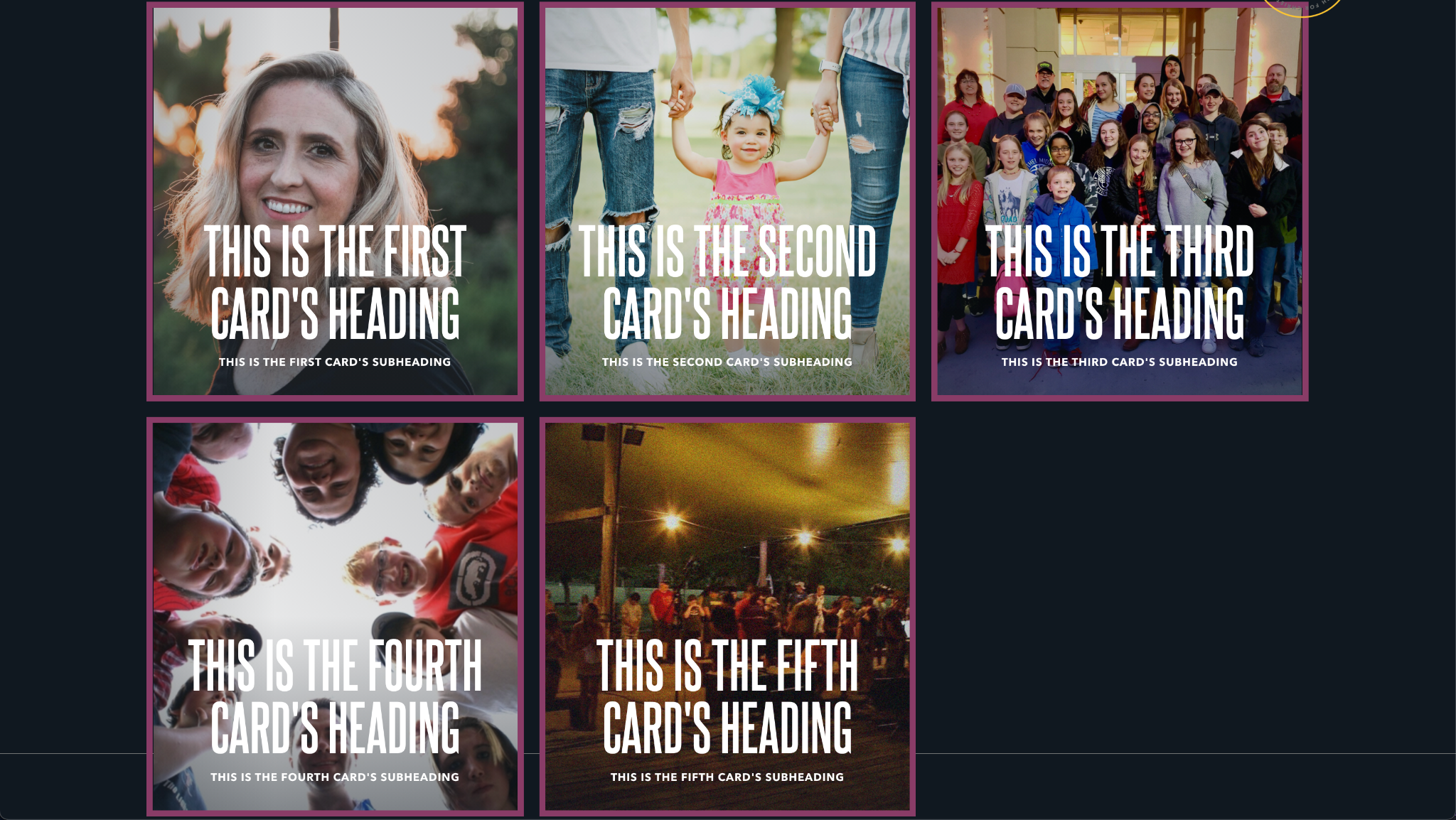
If there are more than three cards, then only three will show per line.
Usage
This is a useful block for illustrating multiple calls to action or a short list of links. In contrast to flex cards, feature cards always appear on the same line. Because of this, try to line up card subjects that are related—for example events shared by the same ministry or blog posts by the same author.
Keep cards quick and snappy. They should entice readers to learn more, not offer all the information they may need. And while you can have these cards without images, images really help increase the impact of each card. Because images also take up the full area of the card, make sure they are high enough resolution pictures.
Finally, try to only use multiples of three cards in this block; cards do not reflow to center themselves within the block’s area. See the Examples section below for an illustration.
On links
Cards can be made clickable by including a link. If a card has a link, it will show a unique hover state when the reader mouses over the card.
Note that the link of each card is a relative link. That means instead of replacing the entire URL in the browser, it appends the link to your website’s domain. This can be avoided by entering the full URL.
As an example the link https://www.google.com will send readers to the search engine page. The link stories/ will send readers to the stories page of your website, if it is located at that path.
Properties
- Background Text: The low contrast, stylized text that appears behind all feature cards. While this text scrolls horizontally as the user scrolls down the page, the text will be obscured by the featured cards. Because of that, this is intended for text that conveys a theme or idea more so than important information.
Each card has the following properties:
- Image: The image displayed within the card. For more information on image properties, see the Media assets section of the Blocks overview.
- Heading: A small piece of descriptive text, stylized in all caps, that appears at bottom of the card.
- Subheading: A small piece of text, stylized in all caps, that appears just beneath the heading.
- Link: The URL to navigate the reader to when clicked. Unless you enter a full URL, this will be a relative link.
- Target: Determines whether clicking the card opens the link in the same window or a new window.
Examples
Three cards

Five cards, showing how an uneven number of cards appears