Flex Cards
The Flex Card block contains one or more card elements, with the block itself having an overarching headline and optional button. Each card can feature several text elements, an optional button, and an image or muted video that fills the card’s entire area.
Usage
Like other card-based blocks, this is a useful block for illustrating multiple calls to action or a short list of links. In contrast to featured cards, which always attempt to appear three to a line, flex cards will resize themselves to match the Layout property’s setting. While cards will eventually reflow to have one card per line on mobile devices, the width of each card will expand or shrink to fit the layout otherwise.
Because these images will flex to fill the space, use high resolution, close up images here.
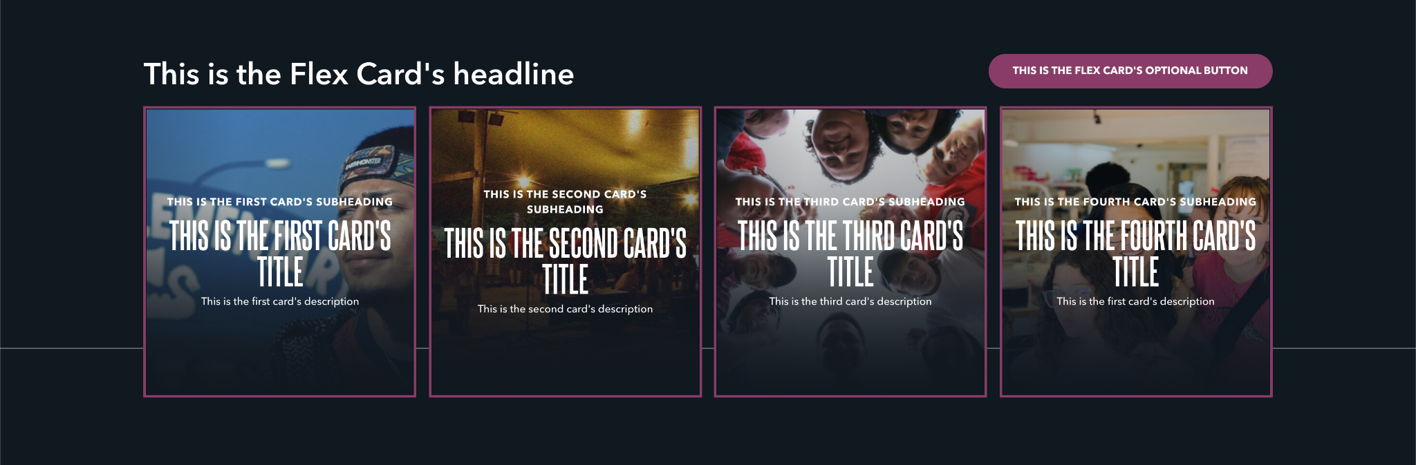
If you’re using the Fourths layout, be conscious that the cards will be much smaller, so fitting a lot of content into cards (or even using a button) isn’t recommended in that layout.
Properties
-
Layout: Determines how many cards will appear on the same line, if the screen size can support it.
-
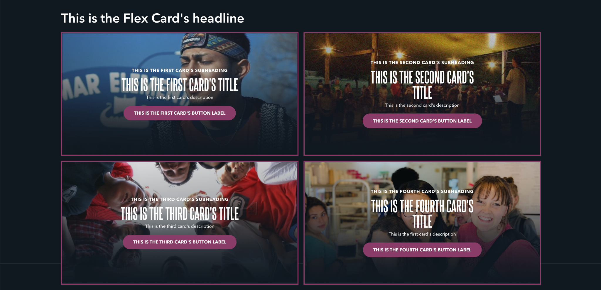
Halves: Two cards appear on the same line.
- Thirds: Three cards appear on the same line.
- Fourths: Four cards appear on the same line.
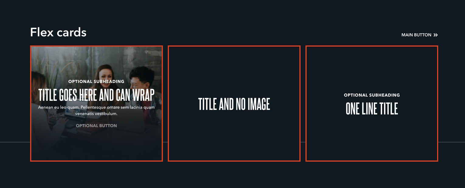
- Headline: The large text that appears above the block’s cards.
- Button: A single, optional button that appears above the cards. This button can navigate users to either an entry or URL. For more information on configuring buttons, see the Buttons section of Blocks overview.
Each card has the following properties:
- Title: A small piece of descriptive text, stylized in all caps, that appears at the very top of the text area.
- Subheading: A small piece of header text, stylized in all caps, that appears at the very top of the text area. Typically used to provide a primary description of the block's intent.
- Description: A longer piece of descriptive text, usually providing more details about the headline.
- Button: A single, optional button that can navigate users to either an entry or URL. For more information on configuring buttons, see the Buttons section of Blocks overview.
- Asset: Determines the type of content presented in the media area, which can be either an image or video. This property determines several other options within this block. For more information see the Media assets section of the Blocks overview.
Examples
Halves layout, with no button on the Flex Card but with each card’s button set to the Primary style
Thirds layout, with a Flex Card button set to the Secondary style
Fourths layout with the Flex Card button set to the Primary style