Impact Block
The Impact Block takes up the full width and height of the page with one or more tiles that each display a heading and subheading.
Usage
This block can be a great introduction piece or transitional piece because it excels at presenting data. If you’re presenting statistics or other types of numerical data, the Impact Block’s tiles can display that data in an easy-to-read format.
Tiles should provide at-a-glance information, with very short headings. Each tile’s subheading should be longer than its heading, otherwise the tiles can look visually unbalanced. If you’ll be using large numbers, consider shortening them with K and M abbreviations.
This block’s buttons all appear on the same line, so consider using the same style for each button so that they don’t clash with each other.
Properties
- Heading: A small piece of descriptive text, stylized in all caps, that appears at the very top of the text area.
- Subheading: A small piece of header text, stylized in all caps, that appears at the very top of the text area. Typically used to provide a primary description of the block's intent.
-
Tiles: One or more tile elements, each with a Heading and Subheading.
Tiles can be added with the Add Row button and removed via the - Remove row button.
-
Buttons: One or more buttons that can navigate users to either an entry or URL. For more information on configuring buttons, see the Buttons section of Blocks overview.
Examples
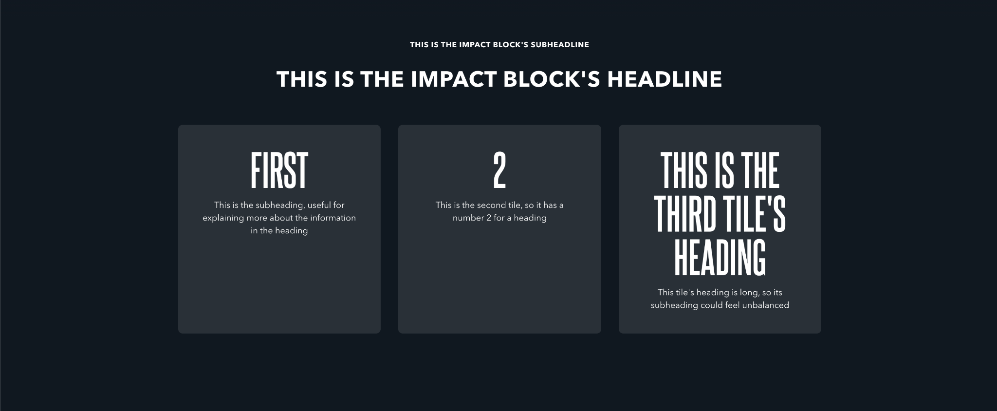
Illustrating the different parts of the block with no optional button
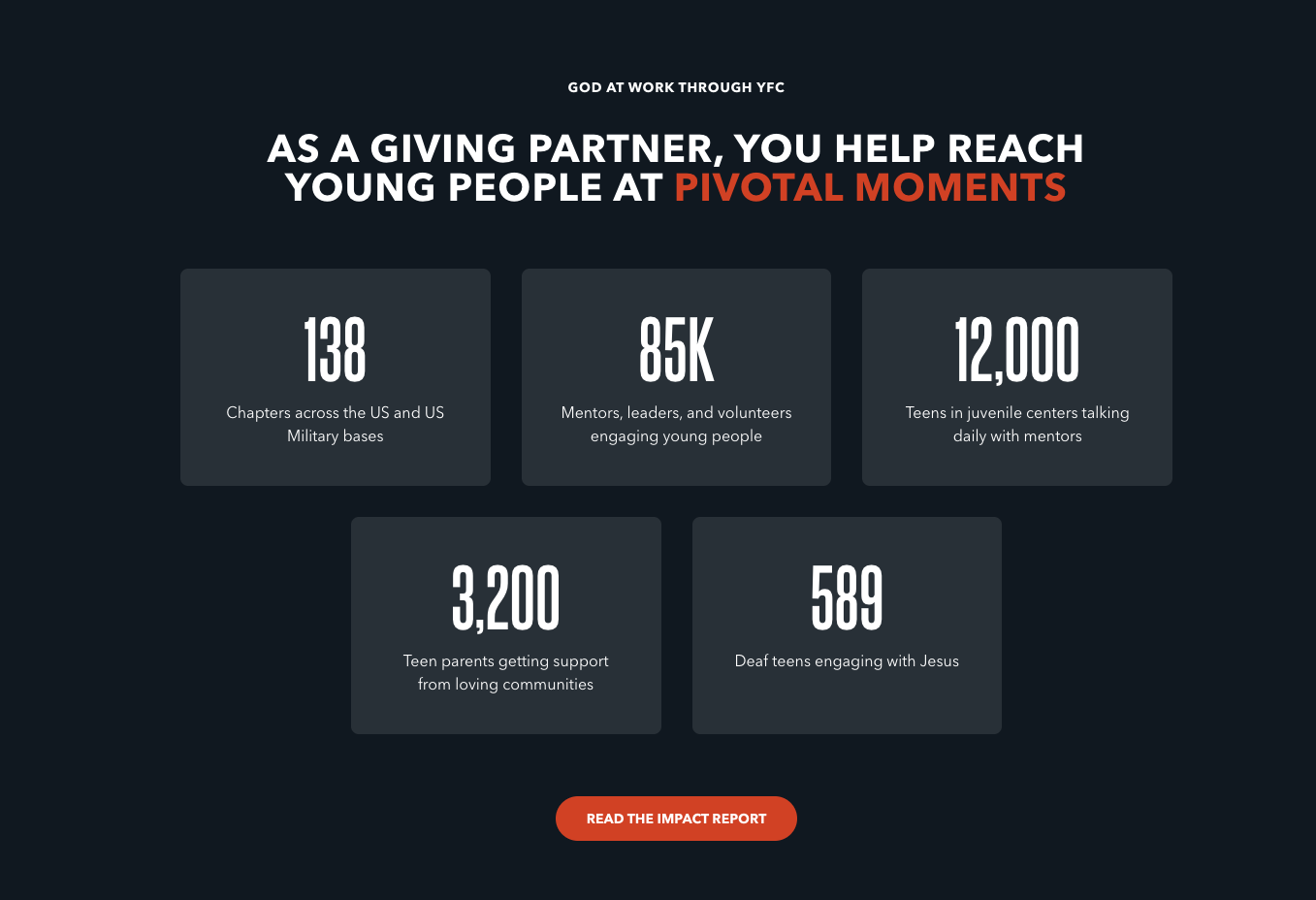
Presenting factual data with a single button