Lead In
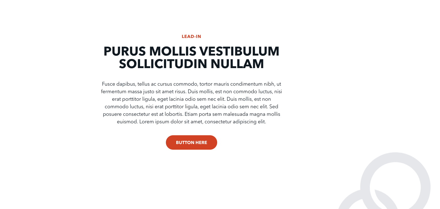
The Lead In block is a structured way to introduce a section with bold, impactful copy. This block has two main sections—the label and headline vs the text (and optional button). The headline features enlarged copy, which is then accompanied by smaller text. These two sections can be styled side-by-side or centered atop one another.
Usage
The Lead In block is meant to grab attention and help set a page’s narrative. Try to tailor your headline’s copy to be bold, attention-grabbing phrasing. The accompanying text can then focus on providing more detail—best presented in quick, bullet point-style snippets.
Its headline text appears either on the left or top of the block. This means not only will readers see it first because of the large text, but also because that aligns with the natural top-bottom, left-right reading order. So be sure that your headline is focused and effective, and use the supplementary text to provide more information.
These blocks can also be effective means to draw a user's attention—so try experimenting with using a button to facilitate reader engagement.
Properties
-
Style: Determines how the copy of the block is laid out. Two options are available:
-
Split: The label and headline appears on the left of the block’s section, while the text appears on the right.
- Centered: The label and headline appears at the top of the block’s section, while the text appears beneath the headline.
- Background Color: Determines the color of the page behind the block’s copy. The headline and text copy automatically contrast with the choice selected here—white background with black copy, black background with white copy.
-
Label Color: Determines the color of label text, which has two options:
-
Default: The label’s color automatically contrasts with the chosen background color.
- Theme Color: The label will always remain the accent color of your theme.
- Label: A small piece of descriptive text, stylized in all caps, that appears just above the headline.
- Headline: The all-caps, large-sized impact statement of the block. The text here will be around 2.5 times the size of normal text.
- Text: The detailed, supplementary text of the block. This text displays either to the right of the headline (split) or beneath the headline (centered).
- Button: An optional button that can navigate users to either an entry or URL. For more information on configuring buttons, see the Buttons section of Blocks overview.
Examples