Left Right Tiles
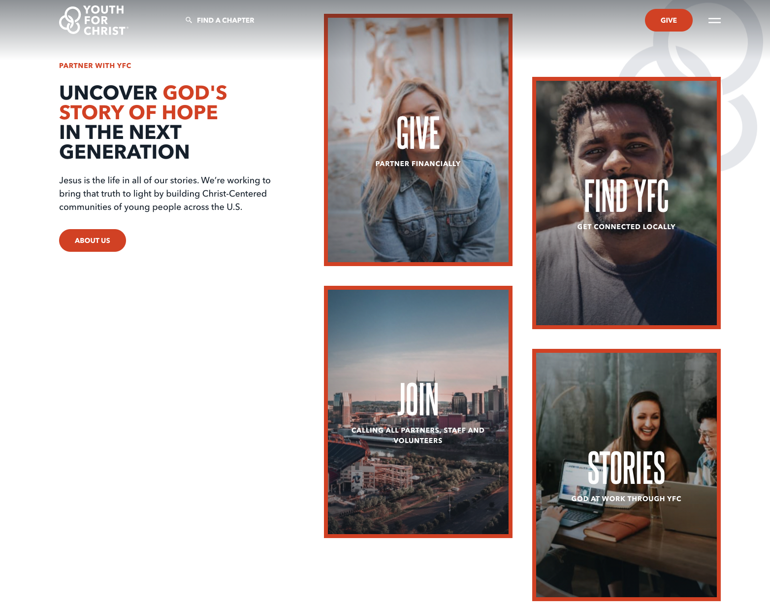
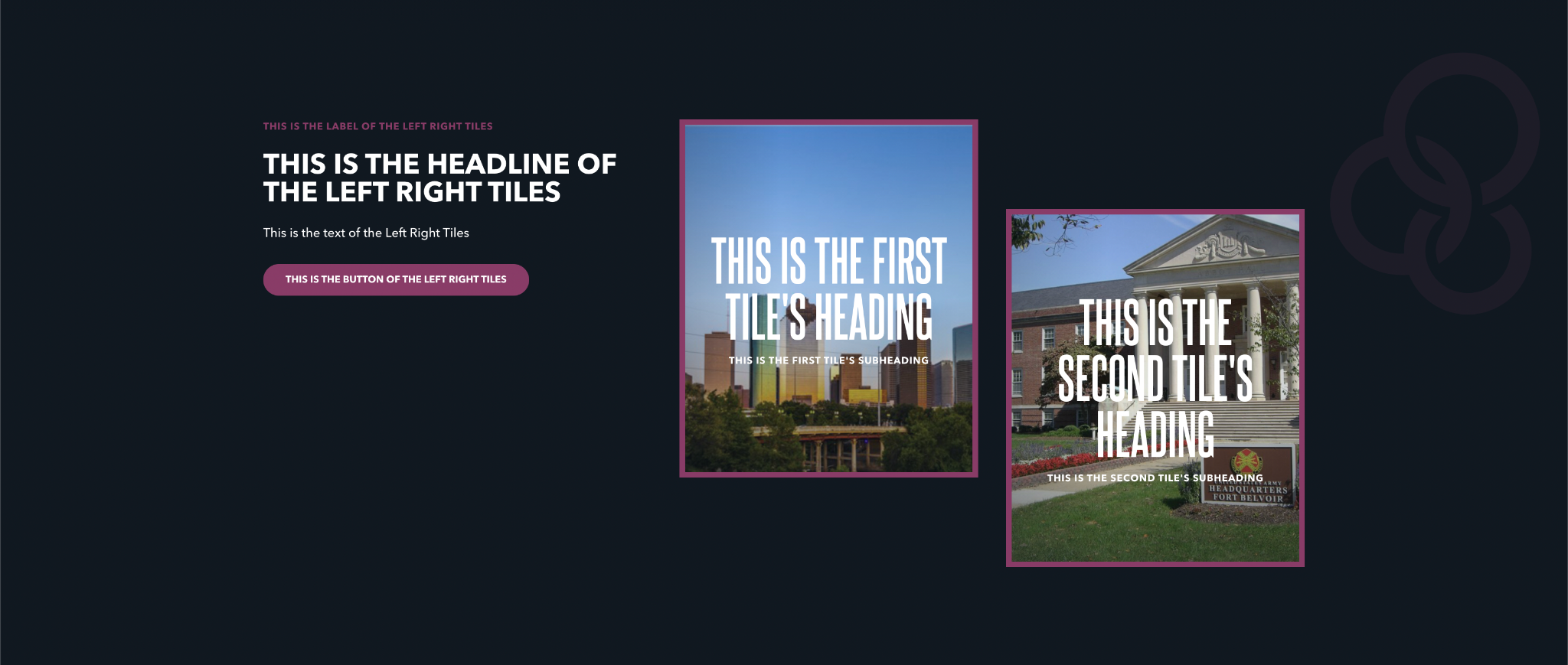
Left Right Tiles have a text section on the left side with cards displayed on the right. The text area contains a heading, subheading, some descriptive text, and an optional button. The card area displays each card staggered into a left/right pattern, with the left cards slightly elevated above the right.
Each card can feature an image and headings. If a link is provided, then the card has a unique hover state and, when clicked, navigates the reader to the specified URL.
Usage
This block is a great way to highlight high-level pathways or calls to action. Because each card can be made clickable, this block provides a way to group related calls to action with dynamic imagery.
On links
Cards can be made clickable by including a link. If a card has a link, it will show a unique hover state when the reader mouses over the card.
Note that the link of each card is a relative link. That means instead of replacing the entire URL in the browser, it appends the link to your website’s domain. This can be avoided by entering the full URL.
As an example the link https://www.google.com will send readers to the search engine page. The link stories/ will send readers to the stories page of your website, if it is located at that path.
Properties
- Label: A small piece of descriptive text, stylized in all caps, that appears just above the headline.
- Headline: The all-caps, large-sized impact statement of the block. The text here will be around 2.5 times the size of normal text.
- Text: The supplementary text of the block appearing beneath the headline.
- Button: An optional button that can navigate users to either an entry or URL. For more information on configuring buttons, see the Buttons section of Blocks overview.
Each card has the following properties:
- Image: The image displayed within the card. For more information on image properties, see the Media assets section of the Blocks overview.
- Heading: A small piece of descriptive text, stylized in all caps, that appears at bottom of the card.
- Subheading: A small piece of text, stylized in all caps, that appears just beneath the heading.
- Link: The URL to navigate the reader to when clicked. Unless you enter a full URL, this will be a relative link.
- Target: Determines whether clicking the card opens the link in the same window or a new window.
Examples
An illustrative example showing two cards
A four-card block, with specific calls to action on each card